AZ Pandemic Numbers Summary for the Seven Days Ending June 8 Plus Hospital Beds Compared to Other Waves
Here are the Arizona pandemic numbers and graph of statewide cases for the seven day period ending yesterday:
Statewide case rates have increased around 30%, close to what they did last week and less than they did the week before that. So although those are increasing, so far they appear not to be increasing at an accelerating rate. The case graph even shows a little flattening over the last few weeks. That is good. Maricopa County cases actually decreased a little.
Deaths and hospital beds went up too, but not drastically. They remain at a fraction of their 2022 high values. Two of the wastewater locations had increases, with Yavapai posting another 2022 record (quite a few COVIDiots up there so this is not a huge shock). Mohave and Tempe wastewater values are down.
All in all, it could be a lot worse—and it has been in the past.
Hospital Beds Then and Now
Last week I wondered how the hospital beds numbers in the current wave compared the the ones during previous waves. For me that is the best indicator of how bad the pandemic is at any given moment.
Before we get to the comparison, here is a chart of the Arizona COVID-19 inpatient bed utilization (proportion of beds) over the course of the pandemic using a seven-day average of numbers from healthdata.gov:
This shows, for one thing, how horrible things were two summers ago with the OG virus and no vaccines. More than 70% of all hospital beds were full of COVID patients. That is hard to believe!
The peaks were decreasing nicely with subsequent waves until the stupid Omicron virus came to visit. But even that—which (as you can see from the case graph) had a huge and fast spike in cases—came nowhere near the hospital utilization on the first and second waves.
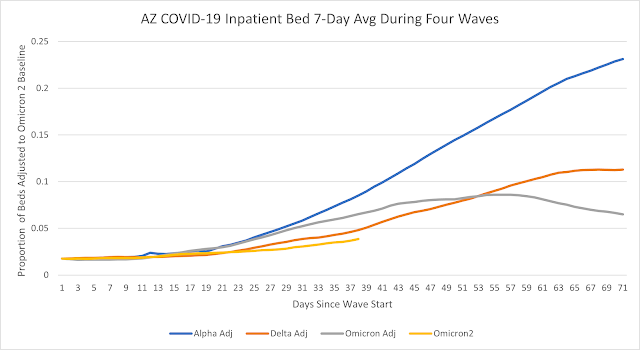
To generate the comparison graph I identified a start date for each wave, defined as a minimum value before the beds utilization started to go up. That was 10/15/20 for the Alpha wave, 6/3/21 for Delta, 10/18/21 for the original Omicron, and 5/5/22 for the current Son-of-Omicron wave. I then got 70 days of values after each starting point (except the current wave).
So we could get an idea of how the rate of increase compares for the four waves, I subtracted the difference between the starting value of each wave and the starting value of Omicron 2 from each value in the series. This ensures a common starting point in the graph:
The lines all increase at about the same rate for two weeks, which is kind of interesting. But then the lines diverge.
The current wave looks closest to the Delta wave, but it now appears to be increasing at a slower rate. In fact we are currently seeing a slower rate of increase than in any of the other waves.
This is great news for the people who work in hospitals. It is also an indication that these new Omicron cousins are less likely to cause severe disease, even if they are more contagious.
Posts from the Last Seven Days you May Have Missed
- First Monkeypox Case Detected in Arizona
- Why So Many Vaxxed People are Getting It and Why Those Antibody Tests Look Increasingly Useless
- Shady Pandemic News Sources Thrive by Being Better at Giving People What They Want


