AZ Pandemic Numbers Summary for the Week Ending February 5: Light at the End of the Tunnel

Here is the Arizona pandemic numbers summary and graph of seven-day average of new cases for the week just ended:*


You know, it can get pretty depressing doing these summaries when things are going South. Every week things get worse and the only question is how bad they are going to get. Then there are weeks like this one when things are turning around and everything is getting better.
The new case numbers are showing big decreases both in Maricopa County and statewide. Last week I noticed that the county numbers were falling at a pretty much linear rate, so I calculated the slope (about -13 new cases per 100K per day, 7-day average). I applied that to the Feb 1 numbers, predicting how long it would take to get back to December infection levels. It has proved pretty accurate, even slightly conservative:

Unless something happens to change the line, by this time next week we should be back down to under 40 new cases per day. That's about where we were in November and early December last year.
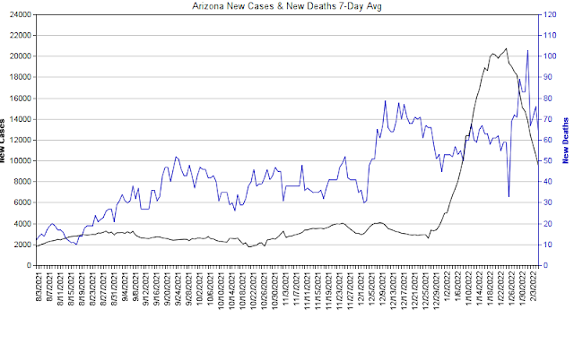
The other metrics are doing well also. Hospital beds are down 6%, and in fact change per day in new beds is now in negative territory, as shown by the dual axis graphs below. Deaths are also down fractionally, though it still looks like the curve is lagging cases as we'd expect.
All in all, this is very good news!

* Unless otherwise noted, data are retrieved from the ASU Biodesign Dashboard