Using the Right Numbers
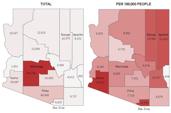
I saw an infographic in the Arizona Daily Star for January 9 that included a map of COVID-19 cases in Arizona broken down by county. They used AzDHS data so I screenshot the AzDHS map (above) using two different settings.
The map on the left is the one used by the newspaper and shows the raw number of cases. It has looked almost identical every day since the virus got going in March. That's because it's not adjusted for population. Maricopa County has almost 60% of the population of the state, so it's always deep crimson. Pima County is next in population, and it's always a rose shade, and so on.
Since the purpose of having a shaded map like this is to compare the counties, let's make them more comparable by adjusting for population (a setting you can, and I would say should, choose on the AzDHS dashboard). The right map shows new cases per 100,000 people for January 9.
It tells quite a different story. Now Maricopa and Pima counties have comparable rates. It's Santa Cruz and Yuma counties that have the highest case rates, with Apache and Navajo counties not far behind (the reservations have been getting hammered for some time now).
My advice is to always look at population adjusted rates (i.e. per 100,000 people) if your goal is to get an idea of where things are better and worse. Better yet, look at population adjusted rates in a moving average. That averages daily values over some period (usually the last week). One chart I consult quite a bit is the new cases by county per 100,000 people 7-day trailing average you can find here.
Averaging smoothes-out extreme high and low readings, which statisticians refer to as "outliers." They can occur because of factors other than changes in the infection process. A dramatic example of this is the two-month positive test percentage chart from the ASU Biodesign Dashboard (which uses AzDHS data):
Daily readings are shown by the Xs. Starting around Thanksgiving, a pattern emerges in which there are low outliers on Sunday, followed by high outliers on Monday. On Monday December 28th, there was an outlier of 138.75%!
Obviously, they did not get more positive results than tests on that day. These outliers are due to problems in the way tests are reported to and tabulated by the state. It appears this is not an anomaly but a recurring problem that cropped up around Thanksgiving and needs to be addressed.
But the point is that the red line, an average over the last seven days, is not very much perturbed by these outlier readings. It gives a more realistic picture of the actual trends in positive test percentage–which, unfortunately, is upward.


